Wednesday, 5 October 2011

Questionnaire write up: Poster

All of the target audience we asked said that they expect the poster to link to the album art work on the Digipak allowing it to be easily recognisable. In our project we will manage this by using the whole image from the main pane or using a small section of the art work from a different point of view. This will allow for a variation of artistic input but still keep the same theme and link with the other two aspects of the project.

The colours that the target audience highlighted as appropriate were the same ones that we use on the Digipak to show continuity and links with all major sections of the portfolio. Red came up as a suggested colour however we will not be using this as a main colour because when used in music magazines the poster will not stand out. This is because the majority of music magazines use red as a colour in there colour scheme throughout the magazine, therefore the audience won’t necessarily notice the poster. Then if the target audience weren’t to notice the poster they would be less likely to buy the Digipak, therefore creating a negative nock on effect which will make the artist loose money. For our actual poster we will not be out casting any colour except for red as a main colour because in order to convey the colours being replaced we are going to have to use multiple colours.

When asked to chose between natural and posed images of the band members, the response was:
The response showed that both styles where equally important therefore we will use a mixture of both in order to keep the variation, and in line with what the target audience expects.


The majority would like to see digitally enhanced images so in our poster we will use some but not of people and not just used because we can't think of anything else. We will use it primerilly on the collage on the images that we want to stand out and make a point.

When we asked them what they would stereotypically expect a poster to have the majority responded with an image of the band. The second majority said it should be colourful as well as edgy and striking. For our poster we will subvert the stereotypical image as we will not be using one large image of the band because we will be using smaller ones worked into our collage or abstract image, it will still be colourful and we will strive to make it edgy and stiking. We will also adhere to using our brand image on the page somewhere using the rule of thirds to make it stand out after peple have noticed our art work.

When asked to chose what they would like to see photographed that wasn't a member of the band, the response was:
 
In our project we will use photos of the actors and actress' which we have in the video possibly in a re created scene taken from the video. The scene can be more stylised and over contrasted bringing out the bright colours in the photo making it the image that stands out rather than text.

 
When asked to chose what type of artwork they would like to see used on the poster, the response was: 
In our poster we will incoperate some drawing elements giving an extra dimention to the artwork and images as if they reach out to you, which is fantastic for a poster because it acts as a persuasive technique. The things we would draw would be most likely multiple clocks growing in scale because clocks were a major motif used in our music video and realte to the Digipak album itself. An abstract image could relate to the double life or the sunset, building the colour and the arty stamp of an Indie/Alternative band. The collage will make up the majority of the page because of it being layed it will build a dimension to the poster allowing it to build more of a piece of art related to the band than poster full of information.

When asked to decide if they would like to see digitally enhanced images , the response was:

Questionnaire write up: Music Video

Music video
When asked about already existing music videos and what makes them memorable the majority said that the video should have a strong and interesting narrative. However keeping it simplistic so it is easily understood by the audience and keeping the originality running through from the video. In our music video we intend to keep the simplicity and the originality elements and making them easy to understand by the audience due to multiple possible interpretations. The simplicity of our narrative will be using the simple ‘double life’ from everyday work to clocking of into a different world which is wacky and colourful. This is where the originality comes into the video because the multiple double life characters will meet at a tea party in the middle of a desolated area where nothing was before the characters turn up.
When components of the video are concerned every single person asked said they thought that a balanced mix of performance of narrative and performance make a good music video so in our music video we shall adhere to this finding. Making sure that the amount of band shots and narrative are split evenly, as close to 50-50 as possible. To show the splits in our video we shall use natural pauses or ends of chapters in the narrative to slot in the performance making it more organised and this will also make sure that the band performance isn’t always on the chorus of the song to show some originality and variation.
For the Indie genre the audience expect to see guitars, shirts buttoned up to the top with no tie and skinny jeans which is more related to the band’s costumes which is something we are definitely going to include in the performance elements of our video. They also expected to see vintage/quirkiness, a unique attitude and colourfulness which will be more inclusive in the narrative of the video and then incorporated into the Digipak and advert photography just because they link the song lyrics, band ethos and video narrative together nicely.  
Whereas for the Alternative genre the audience expect to see more guitars, hear a heavier sound in the music and a lyrical connection to the video which are all aspects which we will use in our music video. We will get use the heavier sound in our video because of our song choice will have a strong indie/punk edge to it. The lyrical connection will be more of an explanation of our interpretation of the ‘double life’ theme in the lyrics themselves.
When asked about colour to be used in the video as an extra theme to tie everything together the theme of dark meets bright/light was the majority’s response. However the suggestion came through to use darker colours like dark blues and reds instead of using the obvious black. However no specific light colours shone through but vibrant ones like green and purple did therefore the colour scheme throughout could be kept to a similar pallet of blue’s, red’s and purple’s to keep consistency throughout the whole project.
For the narrative the audience said that it must explain what the song is about giving it a meaning of the lyrics allowing them to link directly. As a whole it should be emotive however the love theme is overdone and doesn’t link to the lyrics of our song therefore we will not be using that as our narrative. Love theme being overdone would stop us constructing a narrative that was unique, ambiguous and dramatic. Our Idea of the double life characters gives us the chance to make it very different and possibly a little bit odd, but in an arty-ambiguous way, creating a memorable narrative.
The expected style for a music video in general should have an overly used theme, which in our music video will be the evident symbol of double life with the changes that go on throughout the narrative. As well as the double life there will be the subtle changing of light as the sun is setting, along with the actual sunset. The main other consensus which came up was the work vintage. We have decided as a group that the vintage vibe goes with our song choice as the Futureheads are more alternative. We could create this by using extravagant, unique and overly individual costumes and props for the double life aspect, similar to that of the Smirnoff advert and gives the double life theme an extra dimension.
The shots that our audience expect to see in our music video are establishing, close up’s of the band, high angle and head shots. In our music video we will use establishing shots to introduce a new character in the narrative as it will allow us to highlight there boring life and what they do day in day out. We will use close ups of the band, especially the lead singer and the instruments, when their strong lyrics and strong instrumentals come up in the song. The close ups of the lead singer along with the instruments draws the audience into the music and makes them feel the power of what it is trying to get across through the lyrics. The high angle we will be using for the performance as one of the multiple angles we will use to show variety as well as using it for the Tea Party at the end of the narrative because it will show the change to crazy-manic.
The lighting for the performance should be unnatural using stage lights to add colour and professionally to the performance component of the video. Using colours will give the moody atmosphere which links to the alternative genre and heavier sound of the song giving it a stronger ambiguity, or use a dimly lit location to fit with the sunset of the narrative and lyrical connection. One of these ideas we will use for our performance as it gives us a direct link to the bands ethos and way they perform with relation to the alternative genre because it gives it an edge compared to basic stage lighting; Whereas for the narrative elements of the music video the lighting will be all natural light except for that of the indoor parts where the fluorescent light bulbs will take over.

Tuesday, 4 October 2011

Dairy Entry: Tuesday 4th October


Today, me and Katie went in to great depth in regards to our planning time table and schedule. Our planning timetable consisted of dates and times members of our group would be unable to make it, a detailed outline of when we were able to have a video camera and possible things we could film on each day depending on actors. The schedule that we created consisted of the location we wanted for a particular shoot, a props list for things we may need and who is to bring what, and the costumes we thought appropriate of necessary for each scene. On a separate piece of paper we compiled a list of actors numbers, and people we thought may be able to help us technically (ie lighting) this way we would all be able to contact each member if and when necessary.
Iona mainly continued with the audience research of current digipacks by creating a mood board full of front covers and asked students at our school about which one they preferred for an indie band. Iona also helped with the organisation me and Katie were doing for the next two weeks before the rough cut deadline. Alfie has been working solidly on the animatic to get it finished as fast as possible to begin editing our new rough cut footage.

Diary Entry: Tuesday 4th October

Today, me and Katie went in to great depth in regards to planning, making sure we have actors numbers, locations sorted, props ready, camera's booked at the times needed, and fitting in times we are all available. Iona mainly continued with the audience research of current digipacks, but also helped with the organisation of the next two weeks before the deadline. Alfie was doing the animatic again to try to finish it as soon as possible.

Storyboards


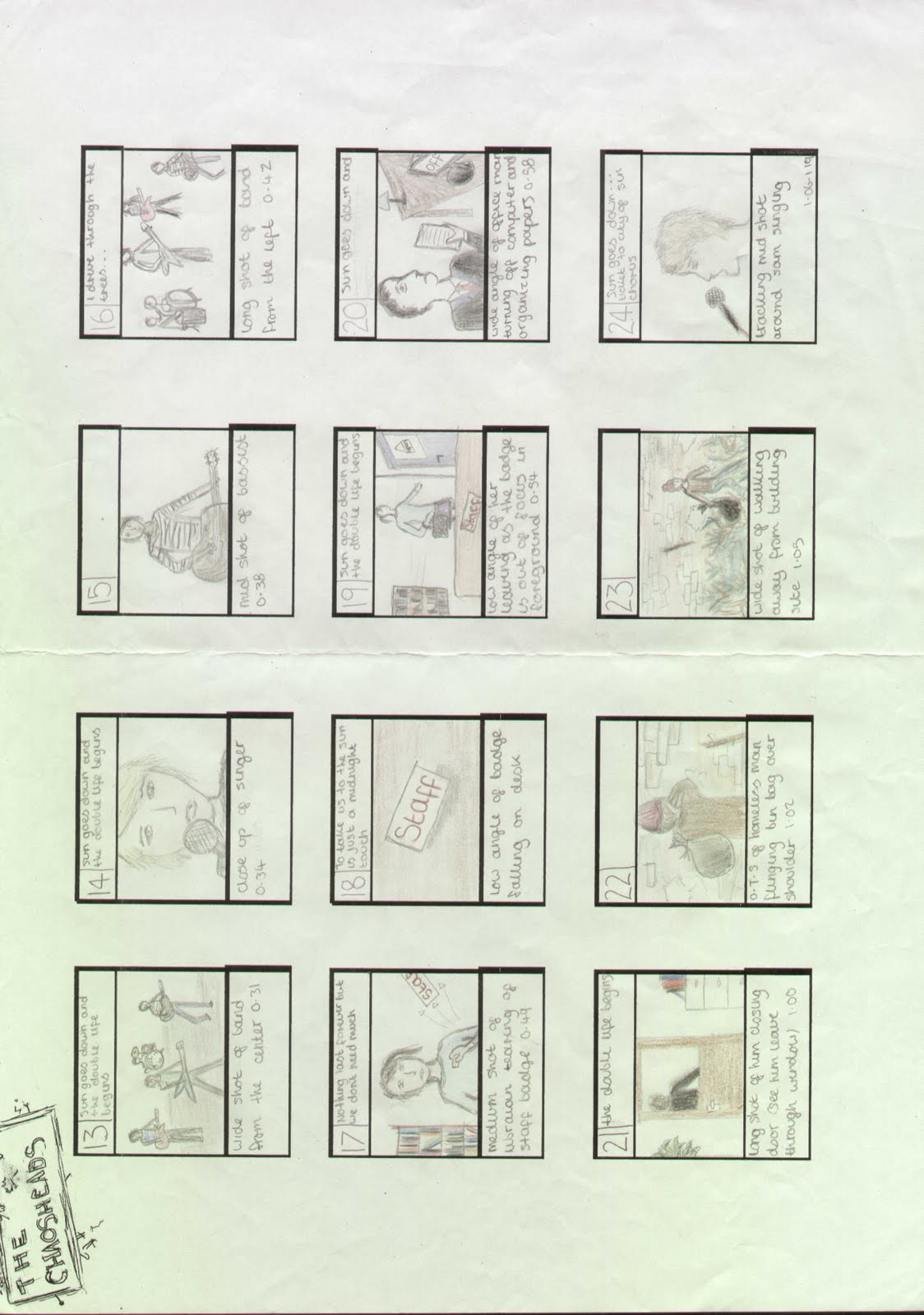
we have finished scanning in our storyboard images, and are progressing with our animatic. These will hopefully help us to progress in our project, and eventually let our filming be organised. We plan to stick heavily to the story board for rough cut, as it has been carefully planned, and then adapt our video where needed for the narrative.


Monday, 3 October 2011

Diary Entry: Monday 3rd October

Again we each took on different tasks to maximise working potential. Me and Katie worked on potential album covers and digipack ideas, including album name, image, album tracks, image ideas, editing techniques and more. Alfie focused on the animatic again, whilst Iona began preparing audience research questions in reference to the digipack. We have all discussed and created a new time table for the next two weeks to manage our time before the rough cut deadline.

Diary Entry: Thursday 29th September

Recently we have been trying to make the best of the time we have in lessons to sort out all of our audience research, storyboard planning, props and animatic before we start our filming. We all took part in discussing and finalising our ideas for the storyboard, incorporating our new ideas and old. Iona took charge of the storyboard, and began colouring it in. Because of her artistic background, and has created a very detailed and eye-catching storyboard. Alfie has been starting to create the animatic for the video which uses the storyboard pictures, but replaces the written text with typed text and puts it to time with our chosen song. I have been gathering our audience research using the video camera to film Whitley Bay High School students commenting on ideas we have had. Katie has been taking the footage I have gathered, edited it, and started to make a short film.