All of the target audience we asked said that they expect the poster to link to the album art work on the Digipak allowing it to be easily recognisable. In our project we will manage this by using the whole image from the main pane or using a small section of the art work from a different point of view. This will allow for a variation of artistic input but still keep the same theme and link with the other two aspects of the project.
The colours that the target audience highlighted as appropriate were the same ones that we use on the Digipak to show continuity and links with all major sections of the portfolio. Red came up as a suggested colour however we will not be using this as a main colour because when used in music magazines the poster will not stand out. This is because the majority of music magazines use red as a colour in there colour scheme throughout the magazine, therefore the audience won’t necessarily notice the poster. Then if the target audience weren’t to notice the poster they would be less likely to buy the Digipak, therefore creating a negative nock on effect which will make the artist loose money. For our actual poster we will not be out casting any colour except for red as a main colour because in order to convey the colours being replaced we are going to have to use multiple colours.
When asked to chose between natural and posed images of the band members, the response was:
The response showed that both styles where equally important therefore we will use a mixture of both in order to keep the variation, and in line with what the target audience expects.
The majority would like to see digitally enhanced images so in our poster we will use some but not of people and not just used because we can't think of anything else. We will use it primerilly on the collage on the images that we want to stand out and make a point.
When we asked them what they would stereotypically expect a poster to have the majority responded with an image of the band. The second majority said it should be colourful as well as edgy and striking. For our poster we will subvert the stereotypical image as we will not be using one large image of the band because we will be using smaller ones worked into our collage or abstract image, it will still be colourful and we will strive to make it edgy and stiking. We will also adhere to using our brand image on the page somewhere using the rule of thirds to make it stand out after peple have noticed our art work.
When asked to chose what they would like to see photographed that wasn't a member of the band, the response was:
In our project we will use photos of the actors and actress' which we have in the video possibly in a re created scene taken from the video. The scene can be more stylised and over contrasted bringing out the bright colours in the photo making it the image that stands out rather than text.
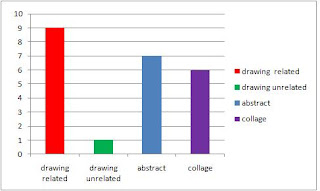
When asked to chose what type of artwork they would like to see used on the poster, the response was:
In our poster we will incoperate some drawing elements giving an extra dimention to the artwork and images as if they reach out to you, which is fantastic for a poster because it acts as a persuasive technique. The things we would draw would be most likely multiple clocks growing in scale because clocks were a major motif used in our music video and realte to the Digipak album itself. An abstract image could relate to the double life or the sunset, building the colour and the arty stamp of an Indie/Alternative band. The collage will make up the majority of the page because of it being layed it will build a dimension to the poster allowing it to build more of a piece of art related to the band than poster full of information.
When asked to decide if they would like to see digitally enhanced images , the response was:


No comments:
Post a Comment