Wednesday, 21 September 2011

Voices of Animals and Men The Young Knives


DIGI-PACK FRONT
The cover art for this album is very individual, a feature that this band likes to exaggerate, and is a constant theme though out all of their work and media. My group will use the previous Futureheads media as inspiration for our own work. The cover has text explaining its self to potential customers, this could be a useful way to Coney information, and I will consider it in my work. The objects in the image are split into the rule of thirds, and no object is centred in the picture, I will attempt to follow these rules in my own photography and cinematography. The insert panel of the Digi pack continues the running them of the cover, by showing the same picture.

DIGI-PACK BACK
The back of the pack is deliberately sparse to draw attention to the artistic text. This text is used to make the ban look, once again, individual, but also to catch people’s eye in the hopes that they might recognise one of the songs, or by drawn in by a title. The placement of the barcode and other information are also sued to drawn the customers eye to the text, I will attempt to recreate this technique in my own work.


ADVERT

The advert represents the band as different from other because of their links to Japan, and their explicit use of these links. The same image is used in the cover of the Digi pack, showing a set recognisable image and theme, so that the customers will be able to link the advert and Digi-pack in their mind. The advert does not contain any English text except for the title of the album, and who it is by, this is a trick to get people interested in the album and then look it up on their own, and then possibly buy it, and is also a technique I intend to use in my project. The consistent colour scheme of different shades of brown is present within this picture, and also makes the text stand out because of its whiteness. In my project I also intend to use differing or contrasting colours to draw attention to certain objects and people, I shall remember the techniques used her, and attempt to incorporate them into some of my designs.
THE FUTUREHEADS HOUNDS OF LOVE


www.dailymotion.com/video/xzdl8_futurheads-hounds-of-love_music
The video begins with the band up a tree, this is because they were running away from dogs that are unable to climb, although is never clarified in the video, and is never linked to again afterwards. Links like this, that only make sense on repeated viewing are good for fans, but can be a gamble when presenting the video for the first time, I shall have to think weather this would this technique should be included in my video. Whilst in the trees the band get to show off their matching formal outfits, which are not exactly the same, but do follow a set style. This shared style is also visible in the casual shoes they are all wearing, which are important in a video based on running away. As well as matching outfits the band are also carrying their instruments, even the drummer, showing the constant music been heard, but also that the band are not playing characters here, that it is just themselves, we will not be including this technique as we are using characters. Contradictor to this the band are all running equally through the story line, where as in performance they are positioned in a classic layout for a band with the singer at the front and drummer at the back, showing a definite line between performance and narrative.
If there was a star image it would be the band performing in a forest, because of the unusual backdrop, although it was not used as anymore important that the other shots used. In my own work I will strive to make our main image stand out and be as important as it can without being obvious.
The music video begins with body shots of all the characters in the narrative; this shows the costumes to the viewer, and immediately introduces them to the theme of the video. After the band member are introduced the camera uses close ups to show their features, and their build up their fame, so that potential new fans know who the artist are. This switch between camera distances could prove useful if i were to recreate it in my own work, because it would immediately get the viewer interested in our narrative, as we plan to use recognisably Victorian costumes. I found that both far away and close ups close shots were used when the performance was first introduced this could be an attempt to use the same techniques in a smaller space of time, but they were more likely used because a range of shots made the band seem more three dimensional, and allowed the viewer to feel their presence more than if they only saw the band from one angle. These shots are mainly of faces, but do focus on hands occasionally, especially the drummers, this is to draw attention to the music, so that the viewer doesn’t get wrapped up in the video, If I were to include this in my video it would make it look more realistic, and professional. To continue making my product look professional I shall use the tripod as often as I can when filming the performance, and have it more mobile during the narrative to show a running story, as shown in this video.
The first few shots are of the band members calling to each other, these could be described as action match shots, showing that the band are connected, and introducing the viewer to the different members. I may be implementing this technique in my own work, because it allows the viewer to become involved by introducing them to all of the band members.’ After these wolves appear on the screen, but only in flashes, this editing technique could be useful to imitate in a memory sequence, or to represent fear. The camera also uses other editing techniques to convey fear including speeding up as they are running, and showing a variety of shots very quickly. The gradual zoom shot used to introduce the band, was in time with the music, and an interestingly dramatic trick to draw the viewer in, I will attempt to the draw viewers in, in a similar style.
The setting that was used linked to the lyrics and theme of the song, because of its wildness, and darkness. “Trees” and “night” are mentioned several times in the lyrics, as well as “hounds” which obviously appear through the music video as well. I will try to transfer objects and settings mentioned in the song we are using to the video we are going to make in a similar style to this. The narrative of the story is a very literal version of the symbolic lyrics, by showing then “running away”, and calling for help. I hope to imitate this connection to lyrics in my own work.

MAXIMO PARK

Maximo park are a similar band to the future heads in genre and style.
VIDEO


http://www.youtube.com/watch?v=nqYkiZ4a1oQ
The video ‘questing, not coasting’ represented the band of ‘Maximo Park’, as a normal Indie band of this time period. The band members wore smart, well fitting clothes that all followed a similar style; only the guitarist presented himself slightly differently from the rest by showing some colour in his shirt. I hope to recreate this similarly dressed effect in my project, as it looks professional, and consistent, giving the band an identity as a unit. The band were also in a classic formation with the singer at the front, drummer at the back, and the guitarist and keyboard is in between them, but not directly behind the lead singer. The colours shown throughout the video contrasted boldly, for example the bands dress being mainly black and white. It made it seem as if there are two very distinct parts of the video, I also hope to imitate this obvious divide technique. The lead singers body language was very visual as well, it seemed to represent a lot of the lyrics and moods that the band were trying to convey, this technique would be good to replicate because of the way it involves the viewer and shows the bands commitment.
This video contained a number of close up shots and middle shots of the whole band, but seemed to alternate between the two. It started with an establishing shot, allowing the viewer to see the projector screen, and the bands outlines, which linked to the contrast of colours mentioned before. The video then went on to focus on the faces of the band and introduce them to the viewer, making them memorable; a technique I intend to use. Along with the variety of close up shots, the video used a lot of minor zoom in shots, this made it seem more dramatic and interesting to the viewer, just as I hope to represent my own work. The camera was also constantly moving in order to give the viewer a sense of involvement in the torrent of music, and made the video seem more dramatic to match the song. This contrasts with the end of the song when the camera stopped tracking and was stationary.
The editing is also used to draw the viewer in and make the video seem more dramatic, by using differing speeds. The editing definitely speeds up as the music get more dramatic, and slows down as the music gets calmer. It also seems to cycle through the members of the band, trying to show an even number of close ups of all of them. I will also attempt to do this in my project, but I do not intend to rely so heavily on performance. A particularly important aspect of this video is how it merged the background and the performance into fade shots, this bridges the gap between performance and what could be described as narrative. I intend to bridge this gap within my own project, as it is a convention in many indie music videos.
This video relied heavily on colour to get its messages across, and to link to the song. The colour of the images in the background related to the mood of the song, such as having a large mainly blue screen for the calmer more depressing part of the song, and a mainly golden screen to go along with the inspiring parts of the song. I intend to use colour in my video to show differences in sections and I will experiment with techniques such as this. Other than connecting the emotional responses of sound and colour the video linked very little to the lyrics, it occasionally showed minor links, such as showing a picture of the weather when it is mentioned. This lack of a specific link will allow me to branch out and show a range of techniques in my project.


DIGI-PACK


The four panels of this music video have a constant running theme of solid emotional colours similar to those used in the adverts and the music video. The front of the pack is very meaningful, it shows an old star chart, possibly to make the band seem profound, but also shows that they are looking for inspiration from older music as well as modern music. The back of the Digi-pack also shows an artistic flare to the band by arranging the song titles in a way other than just a line. I hope to have an image or sequence of images that convey many meanings, whilst still in keeping with the style that the advert and video have set out like show here. The insert uses a striking combination of colours that differ slightly from the previous media shown, but its ambiguous shape, and sold colours could still be linked to the background from the music video.


ADVERT


This advert links to the Digi-pack, because it uses the same name font and graphics as one of the panels. The dramatic and definite colours also link to the music videos use of colour. I hope to be able to have such a definite link in my project. The advert does not have any dates or information on it, this is to build up an heir of mystery surrounding the album, and also to get people to find out the information themselves, and thus feel more invested in the product, I may use this technique in my own work. The simplicity of the design is a convention that I have noticed within many of the products and videos I have studied. Many artist of this genre seem to use an art style that borders on minimalist whilst still intriguing the viewer with the possibility of depth and an over arching meaning, such as having the star chart and nothing else, or having a single picture that is reused. I also hope to emulate this in my designs for adverts, as well as Digi-pack panels to in keep with my genre, and also appease my target audience.

Tuesday, 20 September 2011

Music Video and Advert Analysis: the Futureheads


Music Video Analysis: Christmas was better in the 80's

The video uses a circular structure as it starts with a black and white old school Christmas song music video as which also overlays the band members over each other. This adds depth to the video as it shows that even though they are young they are taking their music seriously but more importantly and specifically the lyrics of the song in which they have written. The black and white colour code instantly shows to that colour and lighting is significant having the flash backs of old footage of Christmas as well as old photos in colour but allowing the colour to not be as bright showing that they are old.
The performance elements of this specific video are singing and ‘dancing’ mainly using mid shots of the individual singing. The only instrument featured within the video is at the very beginning and at the very end with the image of keys on a piano being played but all you can see are the hands making a very artistic shot. With the band crossing over the two genres of punk and indie they use elements of both conventions within their location choices. For example the desolate are with old metal pylons and the way in which the band are positioned in the mid ground within it is a very indie vibe however the connotations of isolation which the location gives sides with the punk genre as it’s different and stands out. Body language from the four and the costumes also lean towards the indie genre as they seem very relaxed and more like normal people instead of insane punk rock and roll stars however the greyness of the location gives it a gothic edge.

The positioning of the band throughout the video changes but the main one which stands out is the lead singer standing in mid shot whilst the rest of the band are slightly out of focus looking small in the background. This shows that the lead takes more screen time within indie and punk rock music videos and is relatively simple to recreate the convention.


The narrative element to the video is memories of Christmas time and family being together especially when the children are young. To achieve this in a realistic way the footage of the past for these flashbacks comes across as armature film snippets from a range of different characters because of the occasional grains appearing on the screen on top of the footage as well as the contrast of the colour looks a little bit groggy or grey. This again gives the video a minor gothic edge especially this image of an adult figure wearing all black shovelling the snow in what appears to be complete isolation.
The video as a whole product uses the lyrics well to make the video link perfectly to the song by picking out the main lyric ‘Christmas day in the 1980’s’ as their inspiration. All the characters costumes show the typical and memorable costumes of that era with the large multi coloured jumpers and mix and match patterns within outfits. The props they use for the characters mini films which have been cleverly edited together as multiple montages which supplements the performance element of the band. All the editing as a whole is at a fast pace but matching the changes in tempo of the song’s jumpy rhythm created by the guitars and bass.

Advert Analysis: The Futureheads

This being the band's first studio album launch explains the multiple use of the band’s name on the poster in the top third as it repeatedly reminds the consumer who they are. The image being of each individual member of the band is also significant as it develops the consumers’ awareness about the band itself allowing them the possibility to explore them further.
The poster as a whole is very bright, light and indie as they use the space sparingly and include bright colours for the text, like the bright pink. The colour itself gives a fresh face to alternative rock and contrasts there music.  The text itself also contrasts the genre of music as it is semi rounded however the image which is also used on their album art has graphic elements to it but in more of a youthful and bright manner making it more sketch-like, this attracting the younger audience.

Music video and Advert Analysis: The White Stripes

Music Video Analysis: Icky Thump

The video uses a lot of close ups combined with point of view shots from the first moment that the main character is dropped off at the gates of Mexico as if the person telling the story of the narrative changes. This specific close up shot is the second one used in the video and immediately highlights the sinister/gothic nature that the band and the director are trying to convey. In doing so it highlights the individual nature that The White Stripes have created for themselves over the years by always doing their own thing. 

Red and White are the videos two colours which are used in the colour scheme running throughout for every character including the band, except for the male lead who is wearing black. This is because the colours are the White Stripes’ band colours. Also the red and White colours are used to show the significance of love/lust merging to innocence and along with the main man wearing the colour black makes it all have negative gothic connotations. This is because when mixing innocence with love/lust just leads to danger or bloodshed which is the message they try to insinuate throughout the video.
Icky thump explores the risky matter of prostitution through the narrative which is something we couldn’t possibly think of insinuating within our own music product as it would be deemed as offensive. However the way in which director came across this idea because it is mentioned in the lyrics, so when we become creating the narrative for our music video we will look for inspiration within the lyrics. This as a whole allows the song to link to the visuals which you are seeing on screen as part of the narrative element of the video.
The Performance element of the video is split up and breaks up the narrative at regular intervals. It uses mid shots to show the general playing, wide angles to show the elaborate style of playing which they are used to and close up shots for when the song itself comes to a point of significance for a particular instrument and then it proceeds to jump to it. The shots are used in a montage together but all carefully selected to fit with the timing of the song. 

The props and costumes in this music video are very significant as they create the creepy world in which the lead male appears to be stuck. As well as the sinister looking skeleton puppets everywhere the low lighting and near black and white elements of the video give it a very gothic theme. This is added to by the jerky camera movement and the soft focus used on the band at random times.

Advert Analysis: Icky Thump

The poster continues the band’s colours which are also conveyed in the music video by using simple shapes to create a simply designed poster. The black in the background gives the poster an easy background which links both to the genre as well as allowing the colourful text of the album title to overlay on top without becoming unnoticed. The text of this poster is all simple and sharp with the album coming before any reference to the band allowing to make reference to how well known the band actually is. The way that they use just the month of release of the album instead of a specific date makes the suspense go on for longer which is similar to the way distribution companies advertise films.
The main image has no direct reference to the band at all except that it is coloured the band colours therefore it entices people to read the poster’s information by giving them something random and abstract to look at that makes no obvious sense. In doing this they make majority of the background red which if people catch it out of the corner of their eye they will take a second look as the colour triggers ‘danger’ in their mind.

Video Analysis

Arcade Fire- The Suburbs
 I will be focusing on Arcade Fire’s fourth album called ‘The Suburbs’, released in August 2010. The indie/rock band, from Canada, have had great international success. The album debuted at number 1 on the Irish Albums Chart, the UK Albums Chart, the U.S. Billboard 200 chart, and the Canadian Albums Chart. It also received multiple awards including Album of the Year at the 2010 Grammy Awards and Best International Album at the 2011 BRIT Awards. The album itself has the theme of the ‘suburbs’ running through, along with adolescence and growing up and their personal and political feelings which is shown through their lyrics and videos.


‘The Suburbs’, directed by Spike Jonze.

The video is purely narrative and has no performance of the band, which subverts their genre identity as most indie rock tend to have a lot of performance to help band identity. However, in the case of this video I think the narrative is very strong and deeply moving, allowing the video to be memorable without needing performance. 


The narrative is shown through a flashback a boy has from when he was younger, when him and his friends used to play on the streets safely in their protected suburban environment. The group joke around about the war outside their protected community, until the war they thought was a game ends up on their doorsteps and one of the blonde-haired boys gets taken away. The blonde-haired boy returns after serving, he’s more mature and angry about what has happened and blames another boy. The blonde haired boy goes after the other boy, despite his friends trying to stop the fight; the boy is beaten up at work. The video ends with the blonde boy crying after smashing chairs and the other boy is staring at the monster the war has created.

The camera is barely still throughout the video, particularly at the start demonstrating a fluid movement perhaps in a metaphorical sense meaning ‘fast paced life’ or ‘childhood’s being over too fast’. As the motif of the band in this album is generally based on the idea of growing up, I think this fits perfectly. I enjoyed watching this part of the video and thought that the disorientation of the camera made you feel a part of the group as they go on their journey. This movement of camera also fits well with the rhythm of the song, as the beat is constant, fluid and fairly relaxed at the start, setting the tone of the video. I would like to incorporate this into my own video, as I think it brings a reality and a sense of being involved. 
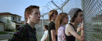


I believe the colours in costume play a particularly important role in the video. At the start, the two main boys are seen mostly wearing white tops which I think portrays innocence and naivety. In the later scenes the blonde-haired boy is seen wearing a white top covered by black/blue jackets, this could be seen as a darkness casting over him, perhaps through his thoughts and feelings war, therefore shadowing over his innocence to give the impression of someone older and stronger. Since the jacket is just covering the white, it could still be portrayed as his maturity has been forced upon him and he’s still naïve inside. This idea would also link to the end of the video where he is crying on the floor after seeing what he’s done and what he’s become due to outside world.

The lighting in the video essentially relies of natural light from the sun for the outside shots. Because they have done this, the reflected light makes the children look more natural and youthful. I would also like to incorporate this into my own work, as I prefer natural light as opposed to artificial light. Again it will make it look sufficiently better in certain shots, providing it links with the narrative me and my group choose.


I personally love the shot of the broken bike outside of one of the boy’s work places. The shot focus’ on the bike from a high angle to make is seem insignificant and lost, as though it doesn’t fit into its surroundings. The boy is seen from a long angle shot, where he stares at bike looking blankly at it. This could work as a metaphor for his now broken and ruined childhood, and that nothing exists of his past. I would like to use this kind of symbolism in my group video, I think that the unspoken emotion is very affective in a video and makes it more haunting.

The video also plays with pathetic fallacy, which helps set the scene and emotion. In their childhood, there are clear skies all around, demonstrating security and everything being simplistic. Then, when they are threatened they are in the dark with the occasional flashing lights, giving the sense of entering the unknown, which to their suburban lives appears threatening.

The settings for the video aren’t too exciting or extraordinary. The use the stereotypes of a ‘American’ suburb, using houses that all look very similar with pristine lawned gardens at the front of the houses, streets that have very little traffic. They also use a desolate field which they cross a few times, again it is nothing spectacular, but sets a backdrop to the scene. I think the simplicity of the setting for the video makes it more appealing to the viewer as there is not too much to focus on.


The lyrics fit the narration very well, taking its own twist of the meaning. The difference between the rhythm and wording of the song, especially at the start is huge. They tend to keep it upbeat but relaxed as they talk about childhood in a derogatory way. For example:
  • “And they told me we would never survive”
  • “You always seemed so sure, that one day we would be fighting in this suburban war”
  • “In my dreams we’re still running and screaming through the yard”
  • “So can you understand, I want a daughter while I’m still young. I want to hold her hand and show her some beauty before the damage is done”
  • “In my dreams we’re still screaming”
The video also demonstrates the bands political views on war. This is shown the through the moment they are by the fence, looking out on to the war zone. I think this is set to show two different worlds. One of the group turns their back to the other world, showing the uncaring nature of people, and getting across the meaning of not caring until it affects you.

There is also a small amount of foreshadowing in the video, where the group of friends are using BB guns and are shooting unsuspecting citizens. In this shot, we see the group of friends in an open stair, looking out and shooting at people. This is a close up shot to all of the children and we can see from their faces they are happy and uncaring about other people’s feelings or consequences. The man they shoot with the gun is shown running to tell them off from a high angle shot, making him again seeming insignificant to their fun. Even though they are only children when they do this, this is the reality of the blonde-haired boy.


The timing is done well, as it links the lyrics to the narrative but doesn’t take the literal meaning of the whole line. For example, when it talks of night it cuts to night but sticks to the narrative of their suburban paradise being threatened.


The editing is simple and slow at the starts, but begins picking up pace towards the end, reflecting the hectic ending. Having very little visual editing makes the video look professional. This is something I would like to consider.


Digipack


Arcade Fire created 8 slightly different types of digipack for their album, ‘The Suburbs’, mostly changing settings and colours but keeping the same dynamic of the car.
The digipack I will be analysing is probably the most common of all as it has been widely distributed in the UK as the ‘main’ one.
The main image running through the digipack theme and on occasional album posters contains the car. The car is of a vintage model, which helps reinforce the look the band are going for, but also links to the idea of a stereotypical 1980’s upbringing in a suburban area. The image of the car is from behind and takes over the bottom third of the cover. We seem to be in the ‘back seat’ of the car, which perhaps is a metaphor for the band taking us on a journey, or being able to transport us elsewhere.


The colours used in it are mainly dominated by a pink tone added to every pane on the digipack. The pink added to the cool shades of blue, green, brown and grey give the sense of a calming cd.
Alike the bands ethos, the cd itself is also very minimalistic but highly effective. It comprises of an all-black cd, and a smaller white circle by the inside of the small hole. The writing ‘Arcade Fire’ above the hole, and ‘”The Suburbs’” below is written in a handwritten font. To me, this gives the feeling of a ‘homemade’ type of cd, which of course fits into the idea of ‘The Suburbs’
The back pane of the digipack consists of the works “Arcade Fire Presents “The Suburbs”” It is written out in a very arty way by playing with the shape of the text. I love the way this has been presented and would like to consider playing round with the shape of the text for my digipack. The font is quite informal and relaxed as they again have gone for the ‘hand written’ look. I think with this type of font you have a much bigger audience base, as it doesn’t appear pretentious, this is something I’d also like to consider for my own digipack. The background to this is of a suburban back garden with a fence, grass and plants. This image is edited to replace the grey and white picture with a pink in grey one to generally fit in to the whole colour coordination of the digipack.

The inside panes of the digipack are photographs of the ‘Suburban’ area in which they have set their whole album around. I suppose for a photography point of view, this picture could be deemed as something non artistic and boring, but actually after edited you see more than just what is in front of you. The colour across the inside panes could be a metaphor could be to subvert the idea of a dull suburban lifestyle, and that you should actually look again to enjoy the simplistic nature.

Poster
The advert for Arcade Fire essentially follows the same look at  the cd, with the same dominating image. This is the theme that links all of their album release together. They still use the same colours and same kind of background, to again follow the continuity of the release.
The advert conveys the same stereotypes brought with adverts, ie release date, band name, name of album.

Video Analysis

Skip To The End- The Futureheads music video

The narrative of the video shows a young couple before they get married, going to a therapist who show them their possible future together to decide whether they will work together. The ending of it is quite ambiguous as we don’t know whether they are still wanting to get married or not.

There is a strong lyrical connection to the video, relating to the narrative of the story line, as the couple are decided whether the marriage is “worth going through with” so they “skip to the end” to see if their relationship ends with “a happy ending or a broken heart”. I love the lyrics and video are linked so closely, and I would like to mimic this for our music video.


It seems as though The Futureheads have focused on the idea of humanity in their video with the themes of love and mortality. They constantly refer to love, marriage, children and growing old in their video at random moments. This also happens with the theme of mortality when ghosts and a skeleton appear. The setting they use, the forest, allows them to do this because the forest allows them to hide when and watch people in their element.

There is no band performance in the video, but only the band standing and singing. This subverts genre stereotypes. They are also wearing black and white tuxs to look like they are a part of a wedding band.


The video is very visually dynamic as it makes you want to watch it again, and the interesting narrative also has this quality. This is a trait I would like to have in my own music video.

The colours in the video are very dark with a contrasting lightness at parts. White symbolises purity, which could link to the theme of love. Black symbolises death which relates to the mortality shown amongst.


The editing used basically consists of the 'cut', but with the ghosts, we are shown an overlaying image on the footage which I think looks adventurous, as it could of quite easily looked cheap.


The costumes for the protagonists are their wedding clothes. They both look quite dated and vintage, which is an excellent look to go alongside the music. The white wedding dress is very simplistic, long and covers most of her body. Her hair is also tied up very neatly and  she appears to be wearing little or no makeup. This could tell us that the female protagonist is very plain and simple. This is also the idea you get from the presentation of the man, his hair and facial expressions are very dull and unenthusiastic.


The video has a lot of medium shots of the characters, often walking and seeing things, yet again with near expressionless faces. I think that the director of the video wants you to feel detached from the protagonists and feel more for the actual band members. This would fit in with their other videos where they seem to be center of attention as their record label probably wants their faces to be seen around.  


 Digipack

 I chose to analysis the Fleet Foxes album, ‘Helplessness Blues’ because I loved the album artwork which is very common for the indie genre.


The front pane is simply album artwork mainly focusing on shapes and faces. It also is as if it is framed making it look again, more like artwork. The colours used contrast the black that follows through the other panes. It is a very detailed intriguing piece of artwork which I think fits the genre perfectly.


 The back pane of the cd has a 1960’s feel towards it with the pictures of the band which was common with groups such as Mama’s and Papa’s. The image is in black and white, and the top of the digipack case has the track list on. There is also a barcode, and credits to producers and such on the back, which is another thing you would expect to see on the back on a digipack case.


The spine simply states “FLEET FOXES       HELPLESSNESS BLUES” in white with a black background. This is another obvious thing that is expected on digipack covers, and without would look unprofessional. 


 On the inside panes it is very simple and minimalistic with having the lyrics of their songs on the back, again in black and white. I love this idea of the lyrics being shown and I would like to consider this for our own digipack.


Overall I think this an excellent representation of digipacks, and I would love to take this into consideration for my own.


Poster

This is a poster from the album release of Fleet Foxes “Helplessness Blues”.
I thought this was a very interesting poster because it subverts the ideas of images and artwork being on posters, as we just see the name of the band.

There is an interesting image inside the band name. We only get a hint at a few of the images behind, but the colours used are interesting and make you curious to know whats behind.

The font is also the same as the one on the cd case, which is a convention of an album release. The portrait size normally subverts the idea of a poster, but I think it works very well in this case.

With the date, name of the album and other information we are shown the really obvious things on the advert.