Music Video Analysis: Christmas was better in the 80's
The video uses a circular structure as it starts with a black and white old school Christmas song music video as which also overlays the band members over each other. This adds depth to the video as it shows that even though they are young they are taking their music seriously but more importantly and specifically the lyrics of the song in which they have written. The black and white colour code instantly shows to that colour and lighting is significant having the flash backs of old footage of Christmas as well as old photos in colour but allowing the colour to not be as bright showing that they are old.
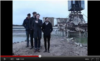
The performance elements of this specific video are singing and ‘dancing’ mainly using mid shots of the individual singing. The only instrument featured within the video is at the very beginning and at the very end with the image of keys on a piano being played but all you can see are the hands making a very artistic shot. With the band crossing over the two genres of punk and indie they use elements of both conventions within their location choices. For example the desolate are with old metal pylons and the way in which the band are positioned in the mid ground within it is a very indie vibe however the connotations of isolation which the location gives sides with the punk genre as it’s different and stands out. Body language from the four and the costumes also lean towards the indie genre as they seem very relaxed and more like normal people instead of insane punk rock and roll stars however the greyness of the location gives it a gothic edge.
The positioning of the band throughout the video changes but the main one which stands out is the lead singer standing in mid shot whilst the rest of the band are slightly out of focus looking small in the background. This shows that the lead takes more screen time within indie and punk rock music videos and is relatively simple to recreate the convention.
 The narrative element to the video is memories of Christmas time and family being together especially when the children are young. To achieve this in a realistic way the footage of the past for these flashbacks comes across as armature film snippets from a range of different characters because of the occasional grains appearing on the screen on top of the footage as well as the contrast of the colour looks a little bit groggy or grey. This again gives the video a minor gothic edge especially this image of an adult figure wearing all black shovelling the snow in what appears to be complete isolation.
The video as a whole product uses the lyrics well to make the video link perfectly to the song by picking out the main lyric ‘Christmas day in the 1980’s’ as their inspiration. All the characters costumes show the typical and memorable costumes of that era with the large multi coloured jumpers and mix and match patterns within outfits. The props they use for the characters mini films which have been cleverly edited together as multiple montages which supplements the performance element of the band. All the editing as a whole is at a fast pace but matching the changes in tempo of the song’s jumpy rhythm created by the guitars and bass.
Advert Analysis: The Futureheads
This being the band's first studio album launch explains the multiple use of the band’s name on the poster in the top third as it repeatedly reminds the consumer who they are. The image being of each individual member of the band is also significant as it develops the consumers’ awareness about the band itself allowing them the possibility to explore them further.
The poster as a whole is very bright, light and indie as they use the space sparingly and include bright colours for the text, like the bright pink. The colour itself gives a fresh face to alternative rock and contrasts there music. The text itself also contrasts the genre of music as it is semi rounded however the image which is also used on their album art has graphic elements to it but in more of a youthful and bright manner making it more sketch-like, this attracting the younger audience.


No comments:
Post a Comment